I embarrassed myself the other day which, for me, is not an unusual occurrence. Since it’s such a common affair, let me clarify that I’m NOT referring to the incident over the weekend at a restaurant when I made my ravenous companions wait while I climbed on a chair to take a photo of my food. IN PUBLIC. Clearly I any vestiges of shame I may have once had has escaped me after performing Teddy Bear’s Picnic in a ballet recital at the age of five.
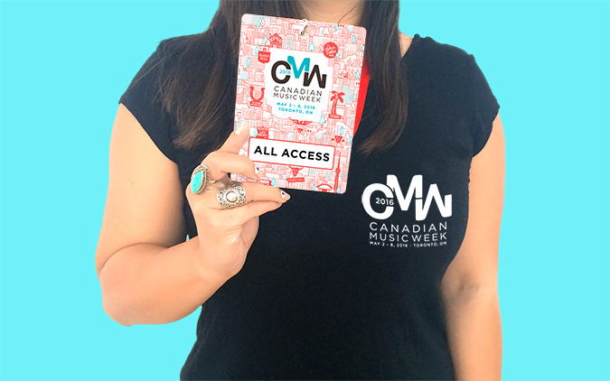
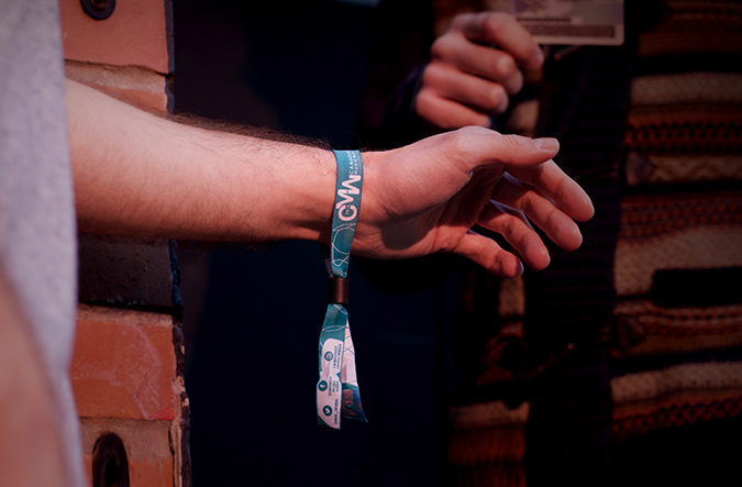
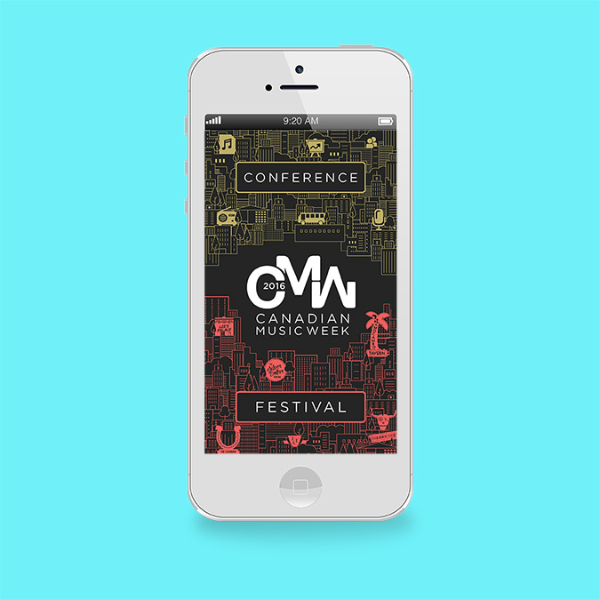
I’m talking about when I went to the Sheraton the other day to pick up CMW wristbands and I went a little fan girl. The logo and creative I designed for the event was on everything from laminates to wristbands to signage and the gig guide! I was so excited to see my work everywhere that I couldn’t help but do a little dance on the spot, clapping my hands like the child I am on the inside. If I still possessed the capacity to feel embarrassed, I would have been since I was in the company of one of my co-workers.

As a designer at a mid-sized studio FULL of designers, it’s not uncommon for us to see our work make it out there in the real world. It’s one of the perks of working at a smaller agency, seeing a project through from the brainstorming stage to production. I suppose I should be used to it by now, having been out of school long enough that I don’t want to specify exactly how long it’s been since I’ve graduated. Sometimes I tease the junior designers, playing the role of the “hardened veteran,” too cool to be affected by the “every day,” almost mundane occurrence of seeing work I developed, pixel by pixel, in the paper next to articles about Queen Bey.
But I think no matter how long I work and how immune I fancy myself to be, I’ll never quite get over the magic of seeing something that was started as a germ of an idea in my mind grow till it becomes real enough for me to LITERALLY hold in my hand. I think that’s one of the reasons I love/need creating so much. Creating allows me to turn ideas into reality; to bringing order and clarity to the abstract. Creating is being understood.
I’ve been working with Canadian Music Week as a designer for the last five years and as the lead creative and account director for the last four but this was the first year that the logo and festival creative I had developed were sharing the spotlight together!
To celebrate the end of a fantastic week of music I thought I’d share some insight into the process behind developing the creative for the event.
Background:
Canadian Music Week is a Toronto-based festival that is considered to be the premier entertainment event in North America. It focuses on the business of music and consists of 5 nights of performances, with 1,000 showcasing bands at more than 60 live music venues in downtown Toronto.
THE LOGO
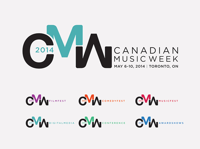
The Problem:
Canadian Music Week needed a impactful, recognizable and versatile logo that could be applied to a variety of collateral, sometimes very tiny, that would reflect the dynamic music festival as well as encompass the importance of the event to the music industry, on an international level. It needed to withstand time and not look dated after a couple of years.
The Solution:
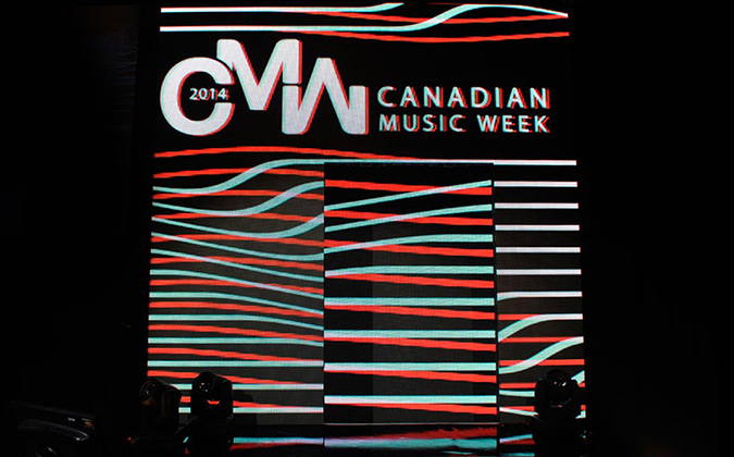
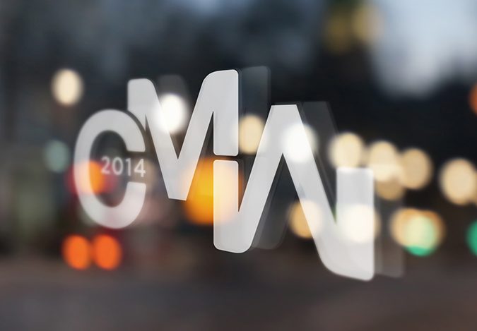
I wanted to express the energy of the event, from the passionate music lovers and creators. Playing with the mirrored shape of the “M” and “W” I crafted the letters in a way that they flowed almost seamlessly so that they would mimic visual sound waves. The “M” could be called out in different ways (colour, a container, etc…), depending on the context, to emphasize the suggested rhythm.
The Result:
The clean lines and broad shapes allowed the logo to print clean on newsprint as well as still be recognizable when scaled down significantly. This logo has replaced previous iterations and the abbreviation is now synonymous with Canadian Music Week.
THE CREATIVE
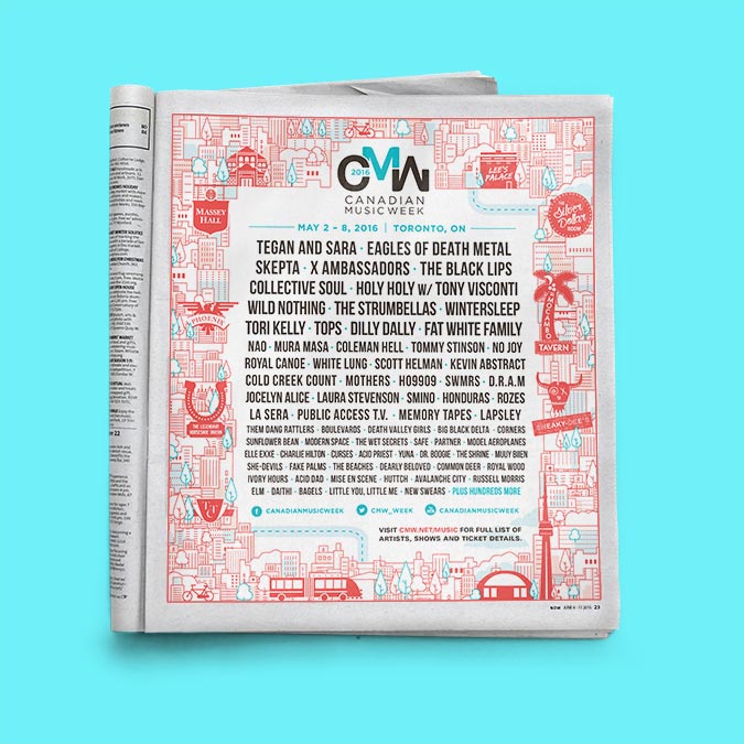
The Problem:
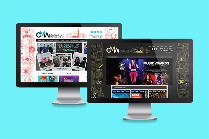
The creative will need to be applied across a variety of collateral in a diverse range of sizes and compositions with tight deadlines and turnaround times. There would have to be a system to distinguish the conference aspect of the event from the festival/music side. A style would also need to be developed that would maintain brand consistency across platforms and into the following years.
The Solution:
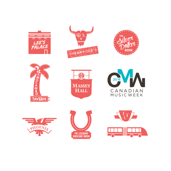
To me, what has always stood out to me was the sheer number of bands, artists, and events that happen at all hours at iconic venues all over Toronto. Keeping in line with the rounded, fluid shapes of the logo letters, I created a modular cityscape that could be built up to compensate for space when there isn’t enough content and could be trimmed down when there was too much. I also developed a series of icons with the intention of distinguishing the festival from conference creative and potentially to differentiate between years. The festival icons were of recognizable concert establishments such as The Horseshoe.
The Result:
It was significantly easier for me to handle the volume of work required due to the versatile nature of the creative. I could also grabs bits of the buildings and blow them up for certain pieces for variety while keeping with the overall look of the festival.
Credit: Images 2 and 4 created by Cosmic Design. Image 3 photographer unknown.


0 Comments