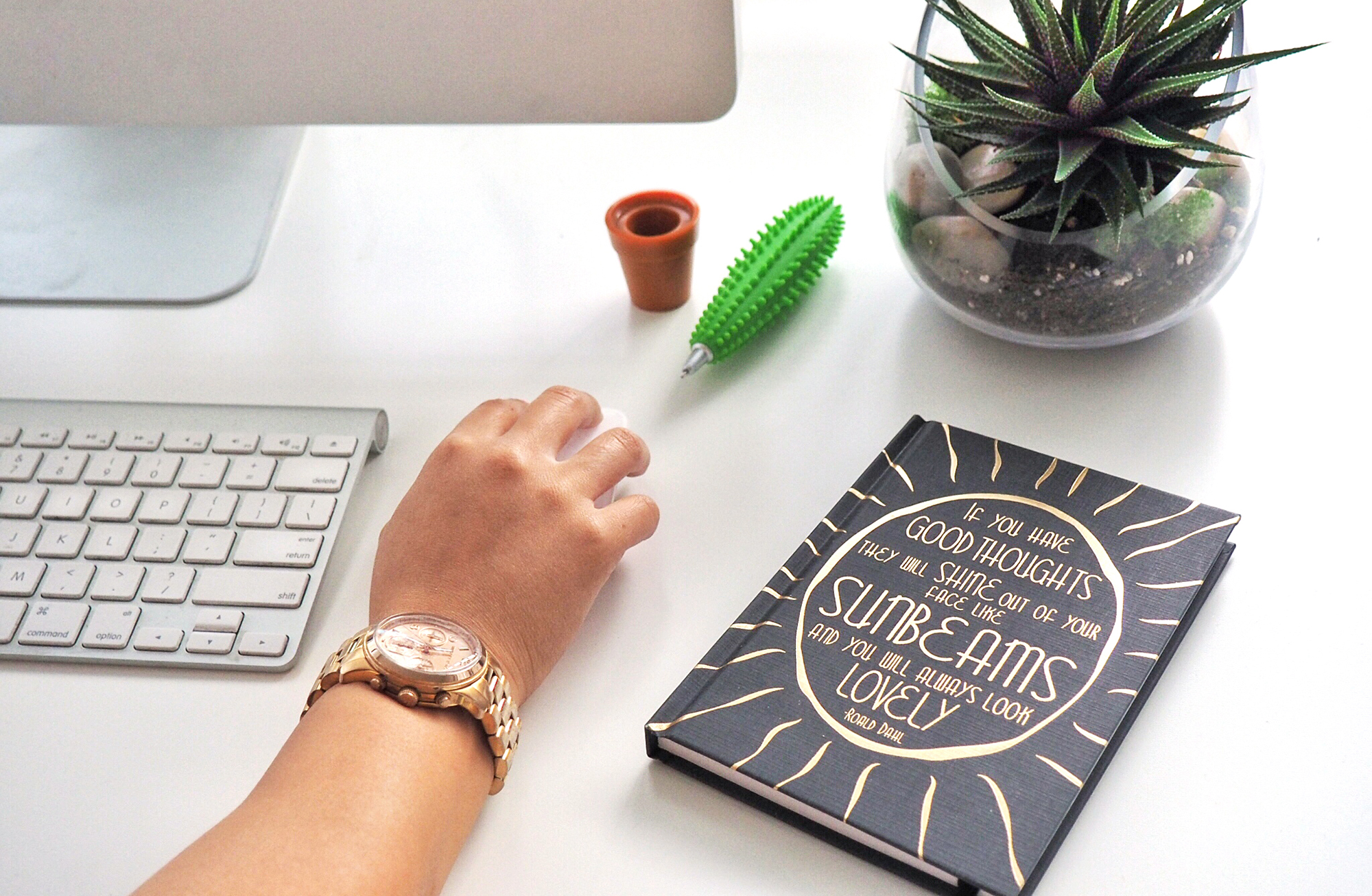
Studying design is not only learning how to actually design but learning how to see which comes in handy if you’re considering how to improve your blog. The problem with that is you can’t STOP seeing everywhere you go, from a hack Photoshop job on subway posters to misaligned items on a menu that lowers your opinion of the trendy restaurant you’re dining at. It’s enough to make a designer lose their appetite. Almost. But not really because nothing makes this designer lose her appetite.
I can’t help but apply what I do from 9-to-5 to other areas of my life from how I dress to interior décor so it was only natural that my design OCD would extend to my ventures in blogging. I’m not only referring to the design of the website but more importantly, to elements that affect the readability of the copy and the intuitiveness of the layout.
RELATED READING:
➳ 7 Things I Learned From Building A Website From Scratch
➳ 8 Things You Learn From A Year of Blogging
➳ What Your About Me Page Should Include (and Why It’s Important!)
If you’ve dedicated yourself to writing a weekly blog post then I’m going to assume that the goal is for people to actually read it. While I’m still learning the ropes of blogging myself, from a designer’s perspective, here are 7 easy tweaks you can make immediately to improve your blog:
01/ CREATE COMPELLING HEADLINES
Before even thinking about whether you created a post that your audience will find like enough to read in it’s entirety, you have to inspire them to click the link to take them to the post. Crafting a compelling blog post title is key to achieving this.
Consider how the copy within the post going to be helpful or interest the reader and be specific. For example, are you more likely to click on a post entitled “Travel Tips” or “The 5 Things You Must Remember Before Travelling”?
02/ MANAGE LINE LENGTH
Have you ever found yourself stuck on the same line in an article, struggling to progress? Do you lose your place every time you finish a line of copy? Poorly structured line lengths may be the culprit.
While having photos go edge-to-edge on the page looks great, the body copy should be adjusted so that there is an average of 30-40 characters (including spaces). Less than 6 words will be disruptive for the eye and more than 15 will be tedious and more difficult for the eye to get through.
03/ (TEXT) SIZE MATTERS
In this instance, bigger is better! Visually, smaller text may look more elegant but design is also about function and if someone is straining their eyes to read your post, they’re not likely going to finish it. Your post shouldn’t require a magnifying glass so if you want people to read every word that you slaved over, go big or go home.
04/ LIMIT PARAGRAPH LENGTH
Sometimes when I receive a really long text message, depending on how busy I am at that moment, I put off delving into it. The problem is that I usually forget about it all together. Ops.
Large blocks of copy can look intimidating to readers, especially in this hurried culture we live in. Break up text into more digestible paragraphs and vary the lengths throughout so the reader doesn’t get scared off from the get go.
05/ SEGMENT INFORMATION
Remember back in the day when you had a book report, you’d have to go to the library, search for the one book on your topic you’d have to check the index for the one paragraph that had in the information you needed? Pain in the derrière. With the advent of Google, people want info yesterday so make it easy for them to find by breaking up your posts with relevant subheads or by organizing it in list format.
06/ EMPHASIZE WITH STYLING
If you look at a chunk of text, it’s easy for key points to get lost within the stream of less important information. Create distinction by bolding or italicizing to pull out significant lines. This styling also acts to visually pull the eye along. Just be aware not to overuse this method because it hinges on using it sparingly. If everything is important then nothing is.
07/ HAVE LINKS OPEN IN NEW WINDOWS
Now that you got someone to visit your blog, you have to keep ‘em there. No doubt your post is packed with informative tidbits and you provide links conveniently within it. What you DON’T want to do is have that link navigate away from your page because the point is to keep them exploring your site for as long as possible. Adjust the action of the link by having it open in a new tab or window versus in the same one as your site.
If you’re thinking of putting together a website, here are some more tips that you may find helpful.
Keep your stalking game strong and follow me @teriaki if you aren’t already!


0 Comments