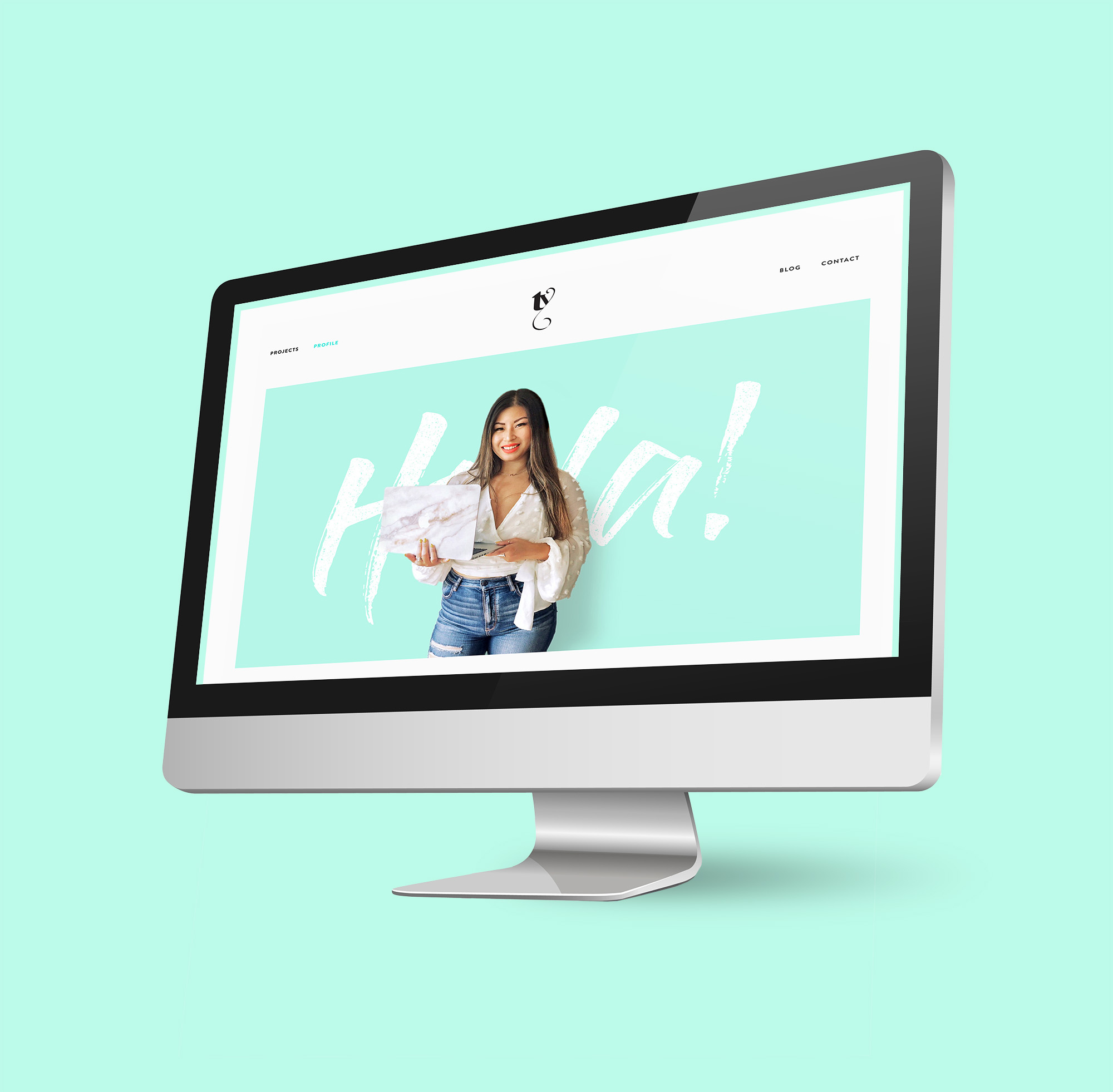
Guys — I’ve finally relaunched my Portfolio Website! Yes — as much as I wish that I was a professional bruncher and as much as my Instagram suggests that all I do it travel and shove noodles in my face (not entirely inaccurate), I actually work for a living as an Art Director and Graphic Designer. And in this digital age, it’s pretty essential for those working in the creative field to keep a fairly current online portfolio.
Putting together a portfolio site is a huge pain in the ass undertaking — from picking your best work, creating mock-ups for projects, writing rationales and not to mention designing the actual website — but I steadily plugged away at it. About a year ago, I had 75% of my portfolio website locked, loaded and ready to launch upon the world…but there was one crucial piece missing — my About Me Page.
At least, it was crucial to me.
Aside from showcasing my best design work and having the overall site reflect my tastes, my biggest concern was that it communicated who I am; what I believe as an individual and as a designer. Easier said than done.
As I discovered, it’s really difficult to write about yourself. It requires personal reflection that can get pretty existential and angsty. There was a whole lot of metaphorical gazing into the mirror and yelling “Who am I?? Who am I??” à la Amy Schumer in ‘I Feel Pretty.’

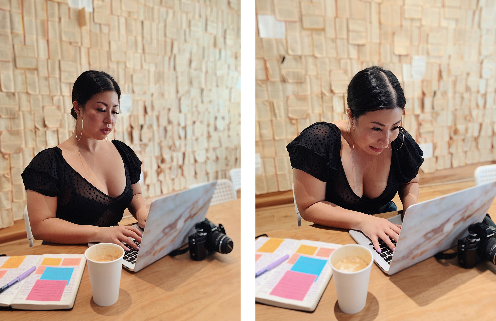
How I look writing my About Me page copy vs how I felt writing it (Photo taken by Vicki Denstedt)
You can’t just word vomit copy onto your About Me Page and press publish.
You have to untangle the pertinent points that relates to you as a designer (or whatever you are) from the irrelevant information.
RELATED READING:
➳ 7 Things I Learned From Building A Website From Scratch
➳ New Year, New Site: Introducing TeriakiTalks
➳ 7 Tweaks You Can Make Immediately To Improve Your Blog
Why is an About Me Page so important?
Listen, it’s understandable that after the tedious ordeal of scraping your website together that you’re tempted to bullet point the basic facts and call it a day. But humour me for a moment as someone who has experience scrolling through a seemingly endless blur of portfolio sites.
Once a design agency categorizes you into one of two silos — “bad” or “good enough” (because let’s face it, after reviewing 100 portfolios, everyone’s work starts to look the same) — and determined that you are competent and capable enough to do the job, they ask themselves: Are you someone I can stand working with for 8 hours a day, 5 days a week? The ones who were memorable and left a positive impression are more likely to get an interview.
Your work opens the door to opportunity but a well done About Me Page will usher you over the threshold.
What should I include in my About Page?
Positioning
Beyond letting people know a little about yourself, what is you intention for your About Me Page? Who is your target audience? Is it small business owners? A corporate agency? A boutique design studio? Are you trying to get a position at a company or aiming to attract some freelance work? Your tone and choice of words will vary based on your end goal.
For example: If my goal was to work for a corporate, buttoned-up, tight-at-the-collar agency where I feel too stifled to express myself *shudder* the playful and conversational tone of my content would not be ideal. Luckily for me, I’ve never coveted of a life of beige cubicles and florescent lighting…
A photo of you (yes you)
Sorry to break it to the camera-shy individuals out there but you can’t really argue with the logic that a page ABOUT you should probably feature a picture of you. People don’t want to engage with (or hire) faceless entities — it doesn’t facilitate trust. People want to engage with real people. It doesn’t have to be fancy portrait but ideally it will be on-brand and somewhat professional.

For example: I wanted to exude friendliness and approachability so I’m smiling and looking into the camera. I wore something that I’d typically wear to work that’s dressy-casual but isn’t too buttoned up. I’m not much of a turtleneck gal.
Credentials
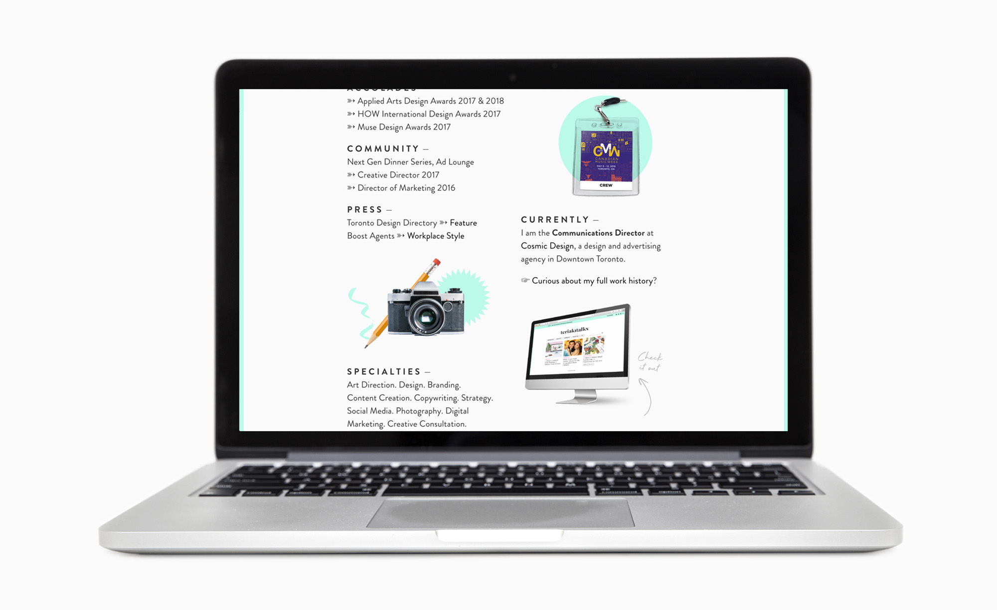
What’s your job title? How are you an authority in the field? Do you have a degree? What are your accomplishments? Where did you go to school? Where have you worked before? What clients have you worked with? What’s your skill set? What services do you offer? These are relevant to mention to establish yourself as an authority in your field but you don’t necessarily have to elaborate on all of them.
For example: Any important points that supported my story, I integrated into my main About Me Page copy. The rest was included Cole’s Notes-style, with a link to my LinkedIn page for more.

Personality
Great, I know what you do. You do the same thing as every other people that’s being considered for the same job. But you are more than what you do and that’s what forges connections and ends up being what people remember. Also, similar to putting a face to a name (and work), infusing personality into your About Me Page creates trust with the viewer. On top of that, it’s what makes people interested enough to habitually return to your site to see what you’re up to.
For example: I tried to infuse personality in everything from my playful tone to the superlatives I assigned to myself (self-proclaimed oversharer, creative swashbuckler, etc..).
Unique Aspect
What is your story? What do you do that makes you stand out from the crowd? Maybe you used to work in retail which gives you insight as a designer or maybe you are also a photographer and you use that skill to elevate your design work. Maybe you took a trip to Europe as a kid that influenced you to start designing. What do you do that and how do you do it differently? Answering those questions will help distinguish you from others within the same field.
For example: My overall message is centred around connection — connection with the client (working collaboratively) and connection with the end user (how does the work evoke emotion?). I tried to establish that in the positioning and personality but in the repeated hook that I love a good story.
Call to Action
People are much more likely to do something if you tell them to. Consider who might be viewing your About Me Page and what actions you want them to take once they’ve read it. If it’s an entrepreneur looking for a designer to brand their new product or service, encourage them to drop you a line to discuss what you can do for them. If it’s an agency looking for someone with your skill set, tell them to reach out at the provided email.
For example: I love talking to people — peers about their passion projects, pros at big agencies with more experience than me, students who need advice — so my CTA directs them to my email or contact page to fill out a form to get the conversation rolling.
You’ve already eaten the entire contents of your fridge so since we’re still in lockdown, it’s the perfect time look at your About Me Page to see where you can jazz it up. Also, go check out my new and improved Portfolio Website! It’s a scary thing to put yourself out there; opening yourself up to criticism but I’m excited for how it’s going to help me achieve my future goals. If nothing else, it gave me a sense of control in a time when I feel like I have none.
If you’re thinking of putting together a website, here are some more tips that you may find helpful.
Keep your stalking game strong and follow me @teriaki if you aren’t already!


0 Comments