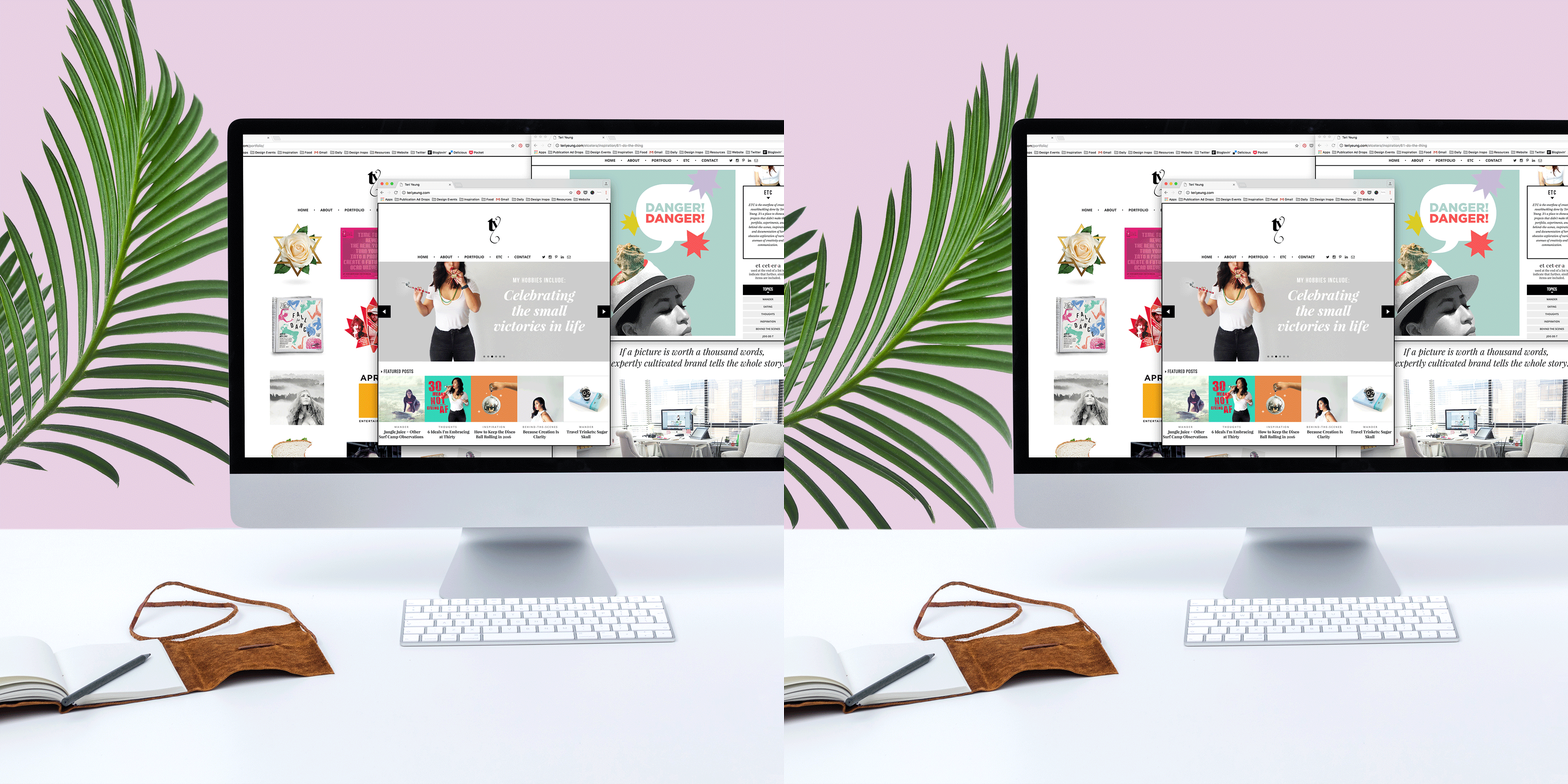
Ever since share-and-tell sessions in kindergarten, I’ve been a big believer in transparency which is what led me to sharing my experience of building a website from scratch. I believe that allowing a peek behind the curtain gives insight for others to learn and understand how things work that can in provide motivation.
As a creative, it’s an absolute necessity to have a some form of an online portfolio and these days, if you don’t have some kind of an online presence, you don’t really exist. Aside from an embarrassing Angelfire website that I created in my teens (shoutout to the 80s babies who know what I’m talking about!) when Google was new and dial-up connection was the bane of my existence, I never had much success setting up my own spot on the web.
After many failed attempts and iterations that never saw the light of day, I finally started to make progress over the last two years. Luckily for me, I got a lot of help from friends who are very talented developers and I myself am a designer. However not everyone who’s building a website have that kind of access so I gathered some tips from my experience and web friends that may help you get started on the right track.
My original website before updating and separating my portfolio and blog.
RELATED READING:
➳ 7 Tweaks You Can Make Immediately To Improve Your Blog
➳ 8 Things You Learn From A Year of Blogging
➳ What Your About Me Page Should Include (and Why It’s Important!)
Here are 7 things that I learned from building a website from scratch:
1/ START WITH THE BASICS
The very first thing you need to do when building a website is a spot on the web. Choose an easy-to-remember, relevant URL and register the domain name. I’m using GoDaddy and you can choose .com or the cheaper options like .net and .org.
You will also likely need somewhere to host your site. I just switched to A Small Orange and there are several packages to choose from, depending on how much space you need.
Not everyone has access to super talented developers so having a website coded from the ground up would be very expensive. If you’re not a designer, that’s an additional cost. However, depending on your needs, services like Squarespace and WordPress offer cost efficient options with flexible templates that are easy to customize. If all you need is a basic portfolio gallery, Cargo Collective or Behance are also good alternatives.
2/ DETERMINE THE ESSENTIAL
In this post, I mentioned a term developers use when building a product called MVP or Minimal Viable Product. This means that what is initially developed to go live is just enough for it to operate on a basic level in order to minimize cost, time, and risk.
I think what prevented me from getting my website live all those years was that I had become overwhelmed by my ambitions; by all the things I wanted the site to be. Once I switched to the MVP mindset I asked myself “What is the LEAST I can do to get this site live?” I had to decide what I essentially wanted the site to be.
As a designer, having a site to display my portfolio was my first priority even though I had always wanted to blog. In the first round I developed the Portfolio, About, and Contact page and built on it in stages from there, eventually adding the blogging function.
3/ OPTIMIZE YOUR “PRIME REAL ESTATE”
Imagine that you actually capture someone’s interest enough for them to click a link to go to your website. The likelihood that they’ll leave your site before venturing beyond the landing page is very high since the reality is that these days, people have the attention span of a goldfish.
What is the ONE thing you want them to walk away knowing about who you are and what you do? That is the first thing they should see after they click your link is prime real estate, as my Mom would say. It should communicate your primary message and ideally peak their curiosity enough to encourage them to explore your site more.
For example, if your main goal is to get them to see your work, your site should open to your portfolio. If you want them to get engrossed in your blog, your most recent post should be the first thing they see. Lay out your site according to what is important to you.
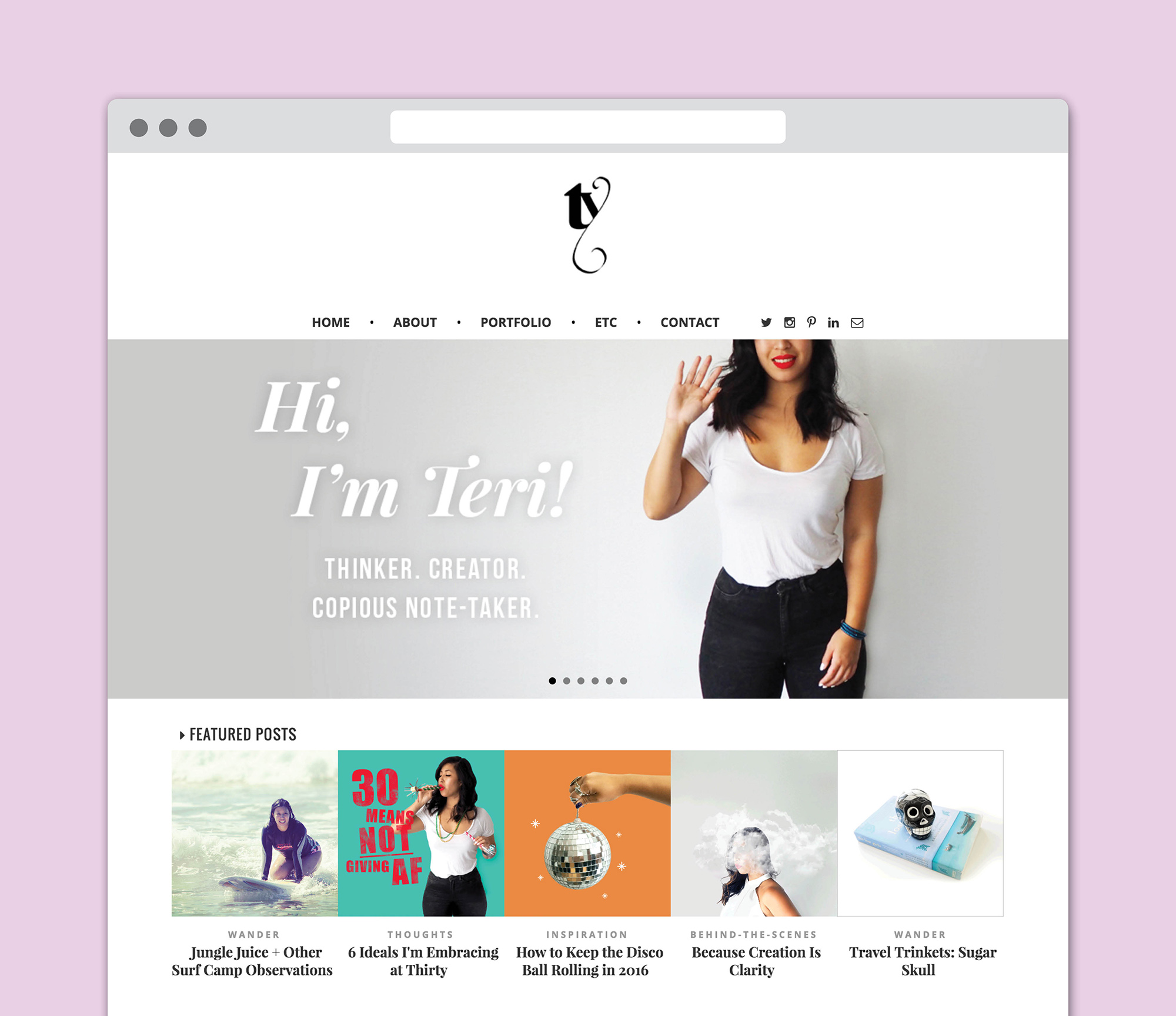
The main thing I wanted to communicate on my site was who I was so the first thing you see is a slideshow of images that tells a mini story about me, what I did, my beliefs, etc… It was important to me for people to have a face to the name and give them some personality to hold on to.
4/ MAKE IT WORK ACROSS PLATFORMS
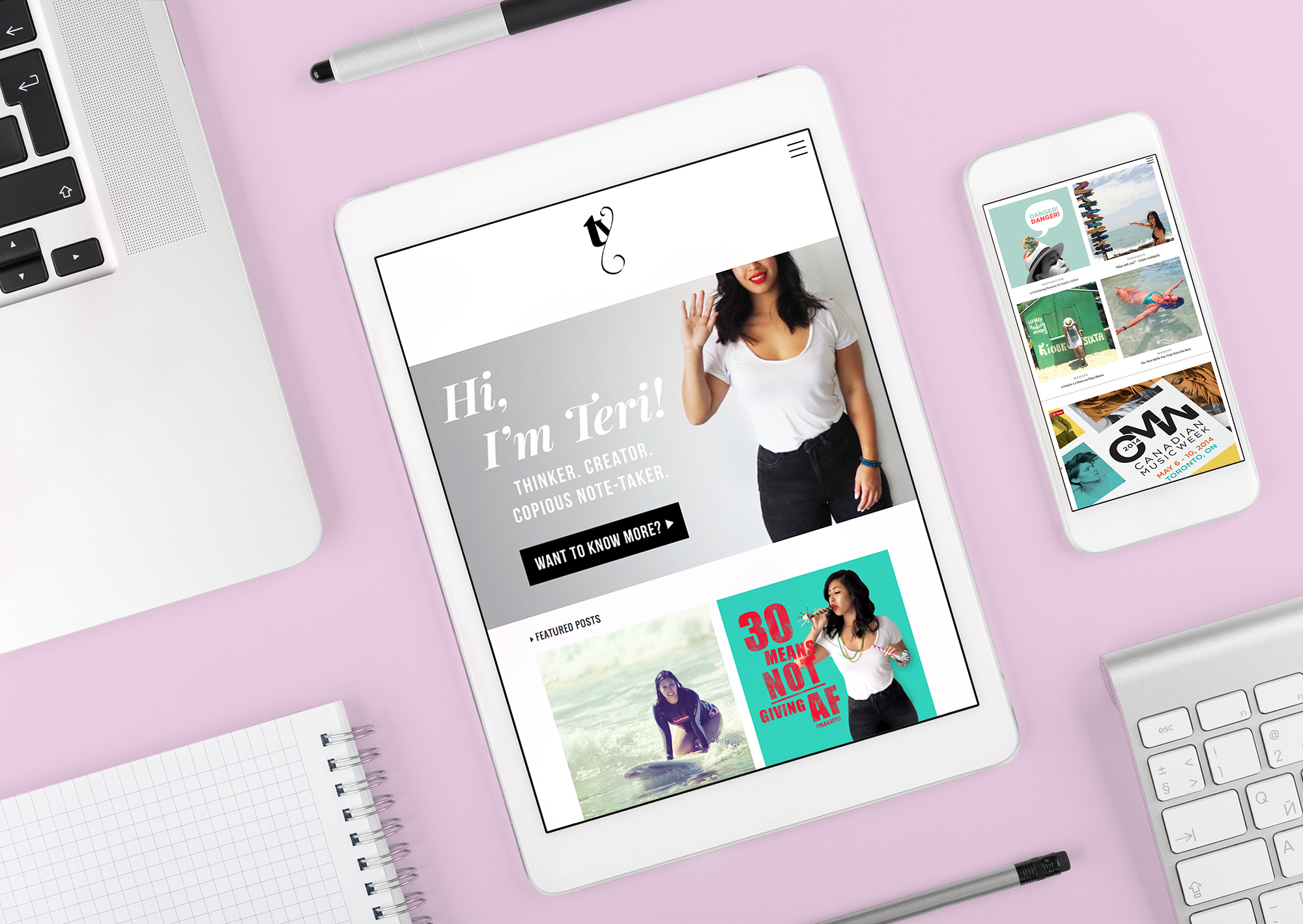
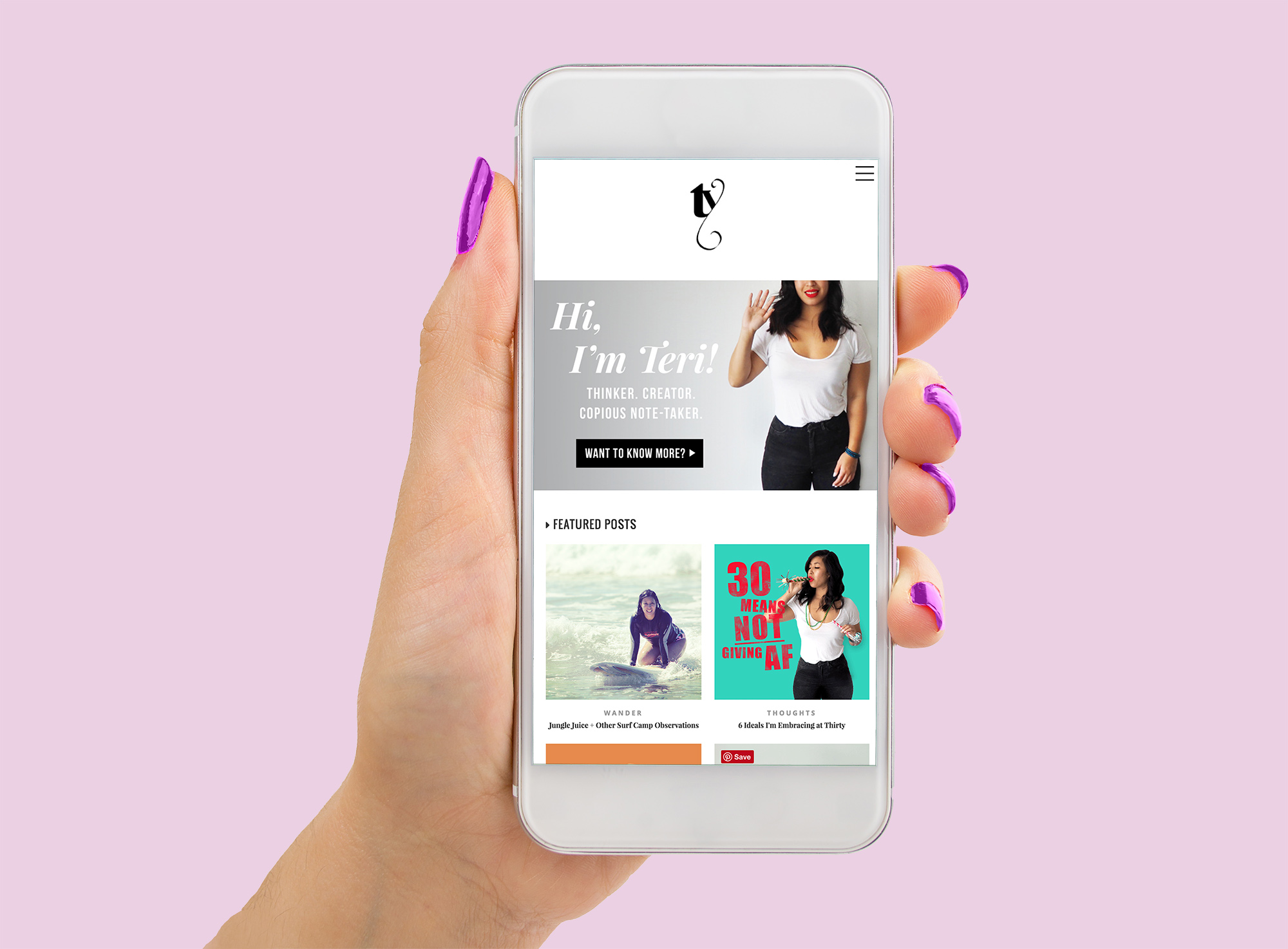
With how much people are on their phones these days, it’s very important to make sure when building a website that it’s responsive. If you’re using a template from a site like Squarespace, it should be coded to configure to devices of various screen sizes like your phone, tablet, and computer. If you’re designing the site yourself, whether you develop the mobile version first then build out the desktop layout or the other way around is dependant on your target audience and where they are more likely to view your site.
For example, if your site is primarily a portfolio site and its main purpose is to send to potential employers, chances are they’d view it from their office computers. If you mostly post links to recent blog posts to your Facebook that friends will check as they wait for the bus, the mobile version should be your focus.
5/ THE PROBLEM DICTATES THE SOLUTION
Ideally, you hope someone visiting your site will explore every page which is why UX/UI (user experience/user interface) is very important to keep in mind. Each breadcrumb you leave for them to follow should be deliberately placed, so that the trail is easy to navigate. When stuck on figuring out how to develop the wireframe of flow on your site, refer to the problem.
If your aim is to keep the user clicking through your portfolio pieces, then that dictates that there should be easy access to the next one by having a button or maybe you repeat the gallery at the end of the page. It should be an intuitive experience.
6/ STAND OUT FROM THE CROWD
I think having a good About Page is paramount! If someone visiting your page walks away feeling like they don’t know you, they’ll forget you in a second, even if your work was fantastic. You want to leave an impression and while you can aim to infuse your site with your personality, your About page is where you get to expand on it. Clearly state who you are and what you do. Explain your beliefs and philosophies in relation to your product or service. How did you get to where you are now? Do you like sushi or pasta?
From my experience sifting through dozens of portfolio sites, a good About page really makes a person stand out in my mind. That makes all the difference when it comes time to call people in for interviews.
7/ IF NO ONE READS IT, DID YOU REALLY WRITE IT?
If you actually want people to READ the copy you slaved over, rearranging commas and wearing out your thesaurus, make it readable! Not only should your font size be fairly large (like 14-16pt) but keep in mind skimmability. This means not having huge blocks of copy, breaking up your paragraphs and pulling the eye along with styling like bold and italics.
Initially when I set up my site I was using small, san serif fonts for body copy because I thought it looked elegant. I found that it made it difficult to read through my posts though so I switched to a large serif. Serif fonts are thought to be easier to read because the serifs make letters more recognizable to the eye.
If you’re thinking of building a website, don’t forget to write a killer About Me page. I’ll tell you why it’s so important and tips for what to include.
Keep your stalking game strong and follow me @teriaki if you aren’t already!




0 Comments