“‘Let your passion spark your profession’. I mean that both figuratively and literally.”
That was how I opened my presentation to OCAD University, rationalizing my solution for a branded poster campaign that they had commissioned.
OCAD University is Canada’s biggest art and design institution and my alma mater. I know firsthand that they encourage boundary pushing attitudes and help develop problem solving mindsets in students, producing some of the creative industry’s best talent. While I may have reason to be biased, I truly believed this (and still believe it) when I was applying to post-secondary degree programs.
All you need is to glimpse the school to know that OCAD is a school that believes in practicing what they preach. They don’t only talk about innovation but they walk it, which is evident in the controversial, checkered tabletop structure that is supported by long, colourful legs in the heart of Downtown Toronto.
They wanted this core value to be reflected in their marketing as well and urged the team at Cosmic Design to “think outside the box” to develop a large-scale poster that would somehow engage high school students and create a lasting impression that was in line with their brand. A piece that would walk the talk.
OCAD wanted to target two groups of high school students:
1) Students who already knew they wanted to pursue a career in the creative field
2) Students who love art and design but didn’t know that they could turn their passion into a profession
I happened to relate to the second group, not discovering that I could turn my obsessive creative interests into a viable career until it was almost too late. I had even done my OCAD thesis on how marketing for art and design schools were not expressing the unique education they provided which is why this project was especially exciting for me.
Initially it was really difficult to break out of the mindset of a traditional poster that is viewed passively (if at all) and at most, elicits a reaction whether it be surprised, joy, anger, etc…But compelling a viewer, especially attention-deficit high school students (the target demographic) to some kind of action was an added challenge.
How could someone physically interact with a poster? I took the path of the ridiculous and unrealistic, opting to come up with as many far-fetched ideas possible and figuring out the logistics later on. I was initially fixated on using thermochromic dyes that would change colour upon heat contact of a person’s hand on the piece but it never clicked.
After a lot of frustrated brainstorming and a glass of wine (or two) with a friend, the idea of a flash-activated poster developed which is what the “literally” in my opening statement refers to.

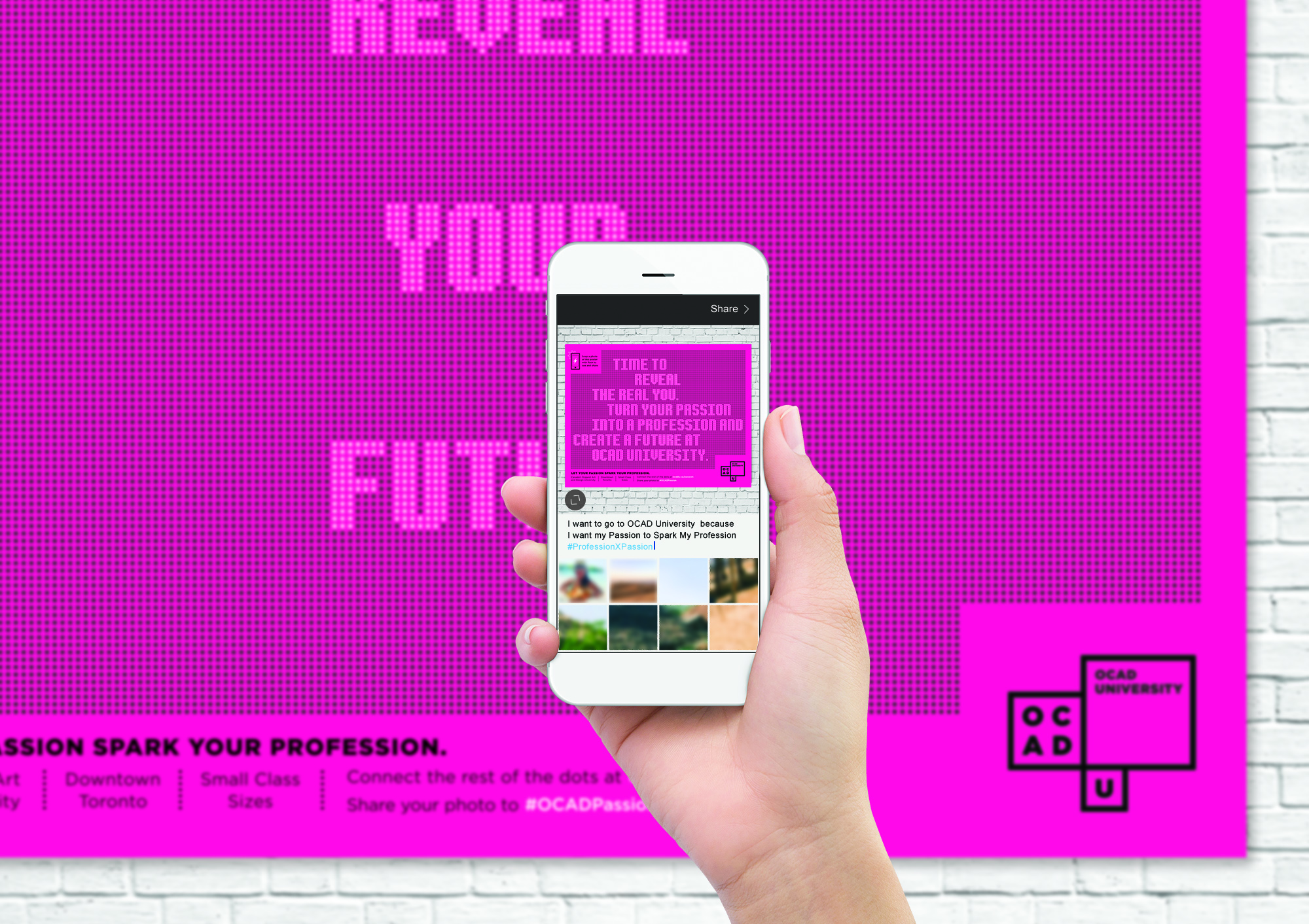
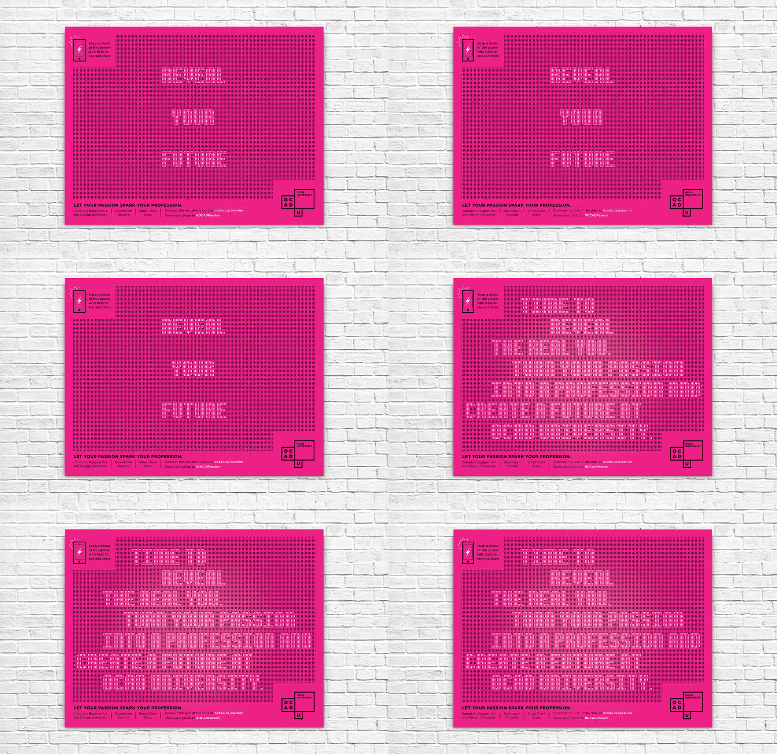
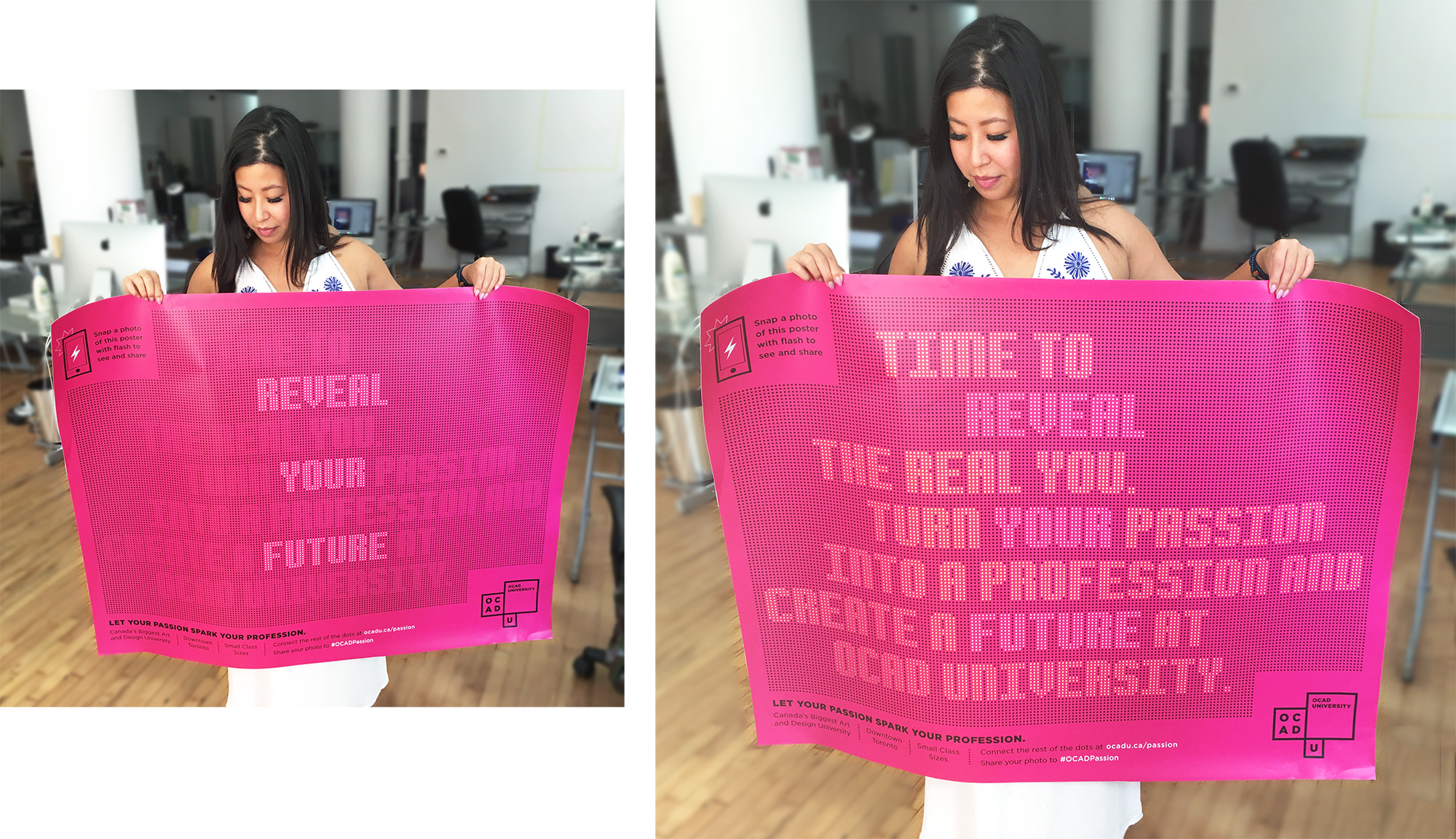
Within a field of gridded black dots, white dots form the words REVEAL YOUR FUTURE which serves as a hint, as well as a call to action. Instructions at the top left corner further urges students to take a flash photo of the poster. Revealed in the photo taken is the full, previously hidden message that forms the full campaign slogan around the already visible one.
The initial teaser copy was meant to spark (pun intended) curiosity enough to inspire students to action. The full messaging was crafted to appeal to a teen seeking to reaffirm and validate their identity by making their first adult decision, committing to a path that fits them.
It was a really satisfying project to work on, having worked on it obsessively from conception to messaging, co-ordinating with printers, and seeing it through to production and installation in the selected schools.
When we received a test print, even though I knew what would happen when I took a flash photo, I still exclaimed in surprise to see the big reveal! Hopefully it had the same affect on jaded, seen-everything, high school millennials and inspired them to the possibility of future in the arts.

Read more about the final piece in my portfolio.


0 Comments