
This year, I came across a quote that perfectly encapsulated the struggle and frustration I felt when I was starting my career as an art director and graphic designer in Toronto:
“Your taste is why your work disappoints you.”
— Ira Glass
People get into the creative profession because they have good taste. But when you’re starting out, the ability execute at that taste level isn’t up to par. It can be so frustrating that most people quit before reaching that next phase of producing interesting, high-level work with consistency. So, how do you attain that degree of mastery of your craft?
In The Outliers, Malcolm Gladwell asserts that “10,000 hours is the magic number of greatness.”
10,000 hours of trying, failing, persisting; throwing things at the wall to see what sticks.
After 4 years at OCAD and 10+ years working as an art director and graphic designer in Toronto, I’ve thrown a LOT of shit at the wall (just to clarify: not literally). Things are starting to stick with more regularity whether it’s because my taste and skills have levelled out or because I started to view every project as an opportunity to not only represent what makes a brand/company authentic, but to simply have fun!
RELATED READING:
➳ How Winning An Award Affected My Impostor Syndrome
➳ Sparking Bright Futures with OCAD U’s Flash-Activated Poster
➳ CMW: Behind the Brand + Creative
My experience as a creative professional has been that I rarely have time to reflect on my wins. Everything is done at such a fast pace that when you finish one project, you’re on to the next. This post is a departure from what I usually write about, but I felt like taking a moment to look back at what I’ve achieved this year.
Here are 6 creative projects that I worked on in 2020 as an art director and graphic designer in Toronto that I’m particularly proud of:
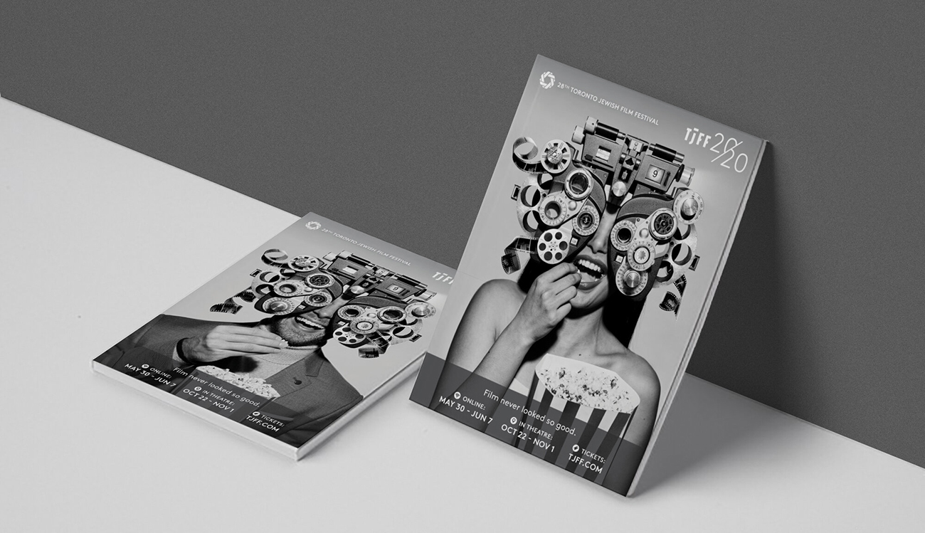
TJFF 2020 Campaign
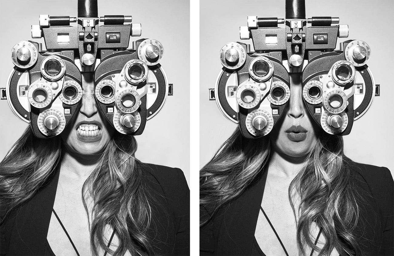
The most difficult part about executing this creative project was getting people to remember what a phoroptor was. Heck, I can’t even get my autocorrect to recognize it as a real word.
Creative would featured models with range of facial expressions.
Phorop-WHAT now? You know, those machines that optometrists use to test your eyesight. When the Toronto Jewish Film Festival requested a creative campaign for their 2020 season I knew it would be the perfect prop. 20/20 vision, get it?
Blending a futuristic aesthetic and old Hollywood glam, the main creative features the attendee viewing the films through the phoroptor. I modified the eye testing instrument with film strips and vintage film projector parts to suggest that TJFF is shaping the vision of the Jewish story.
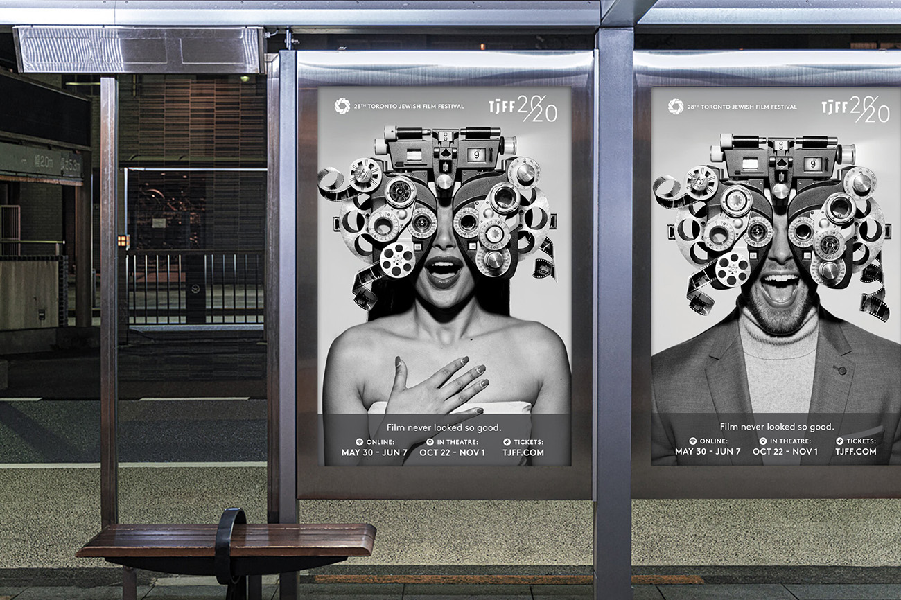
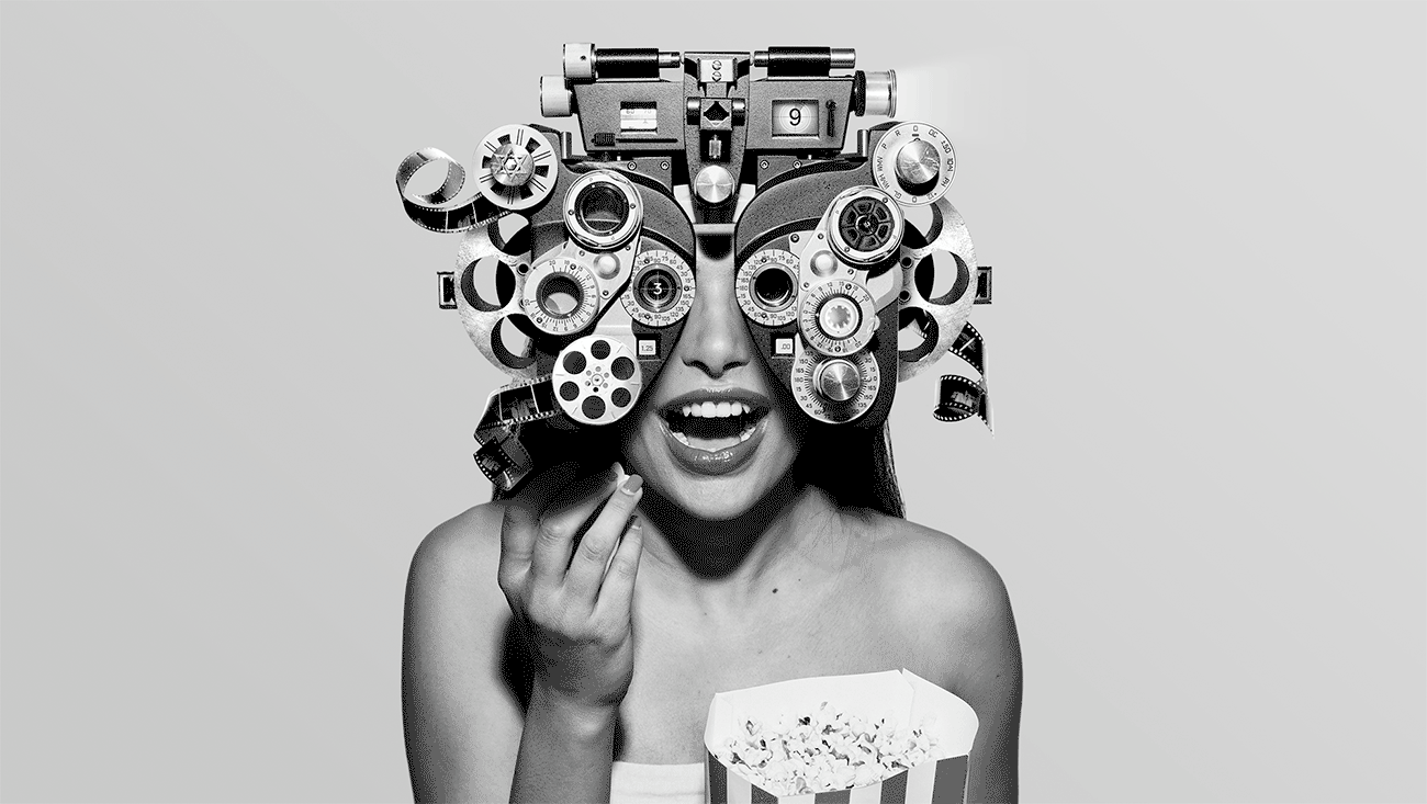
For an animated component, we captured a wide range of facial expressions as if the viewer was reacting to the films in the moment.
While I’m used to impromptu photoshoots of my food, it was nerve-wracking to organize a REAL production. Using my desk lamp for lighting wouldn’t cut it here. From scouring the city for a shoot location with equipment on site, to hand picking talent to dealing with styling, props, etc…it was quite the undertaking.
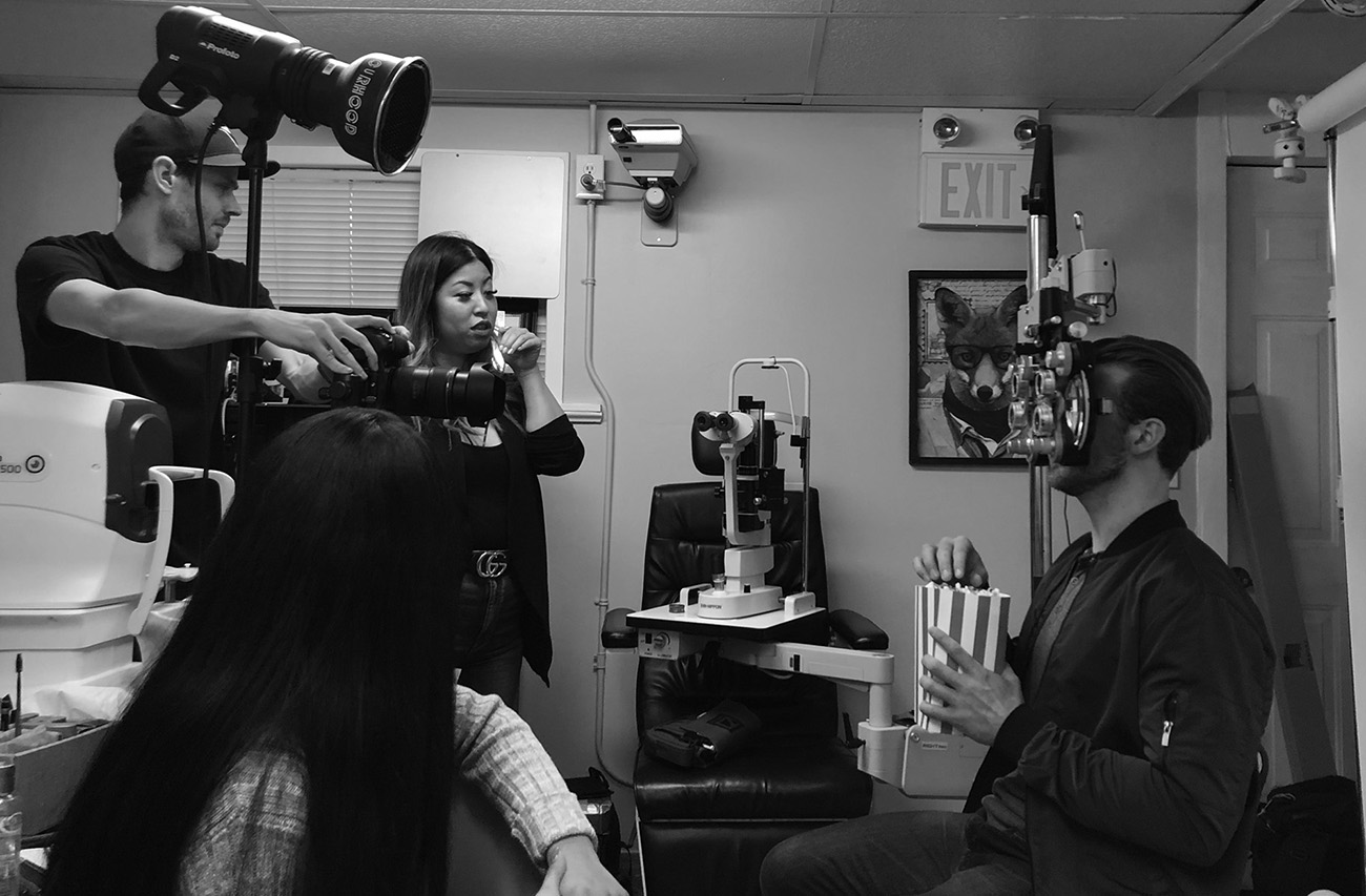
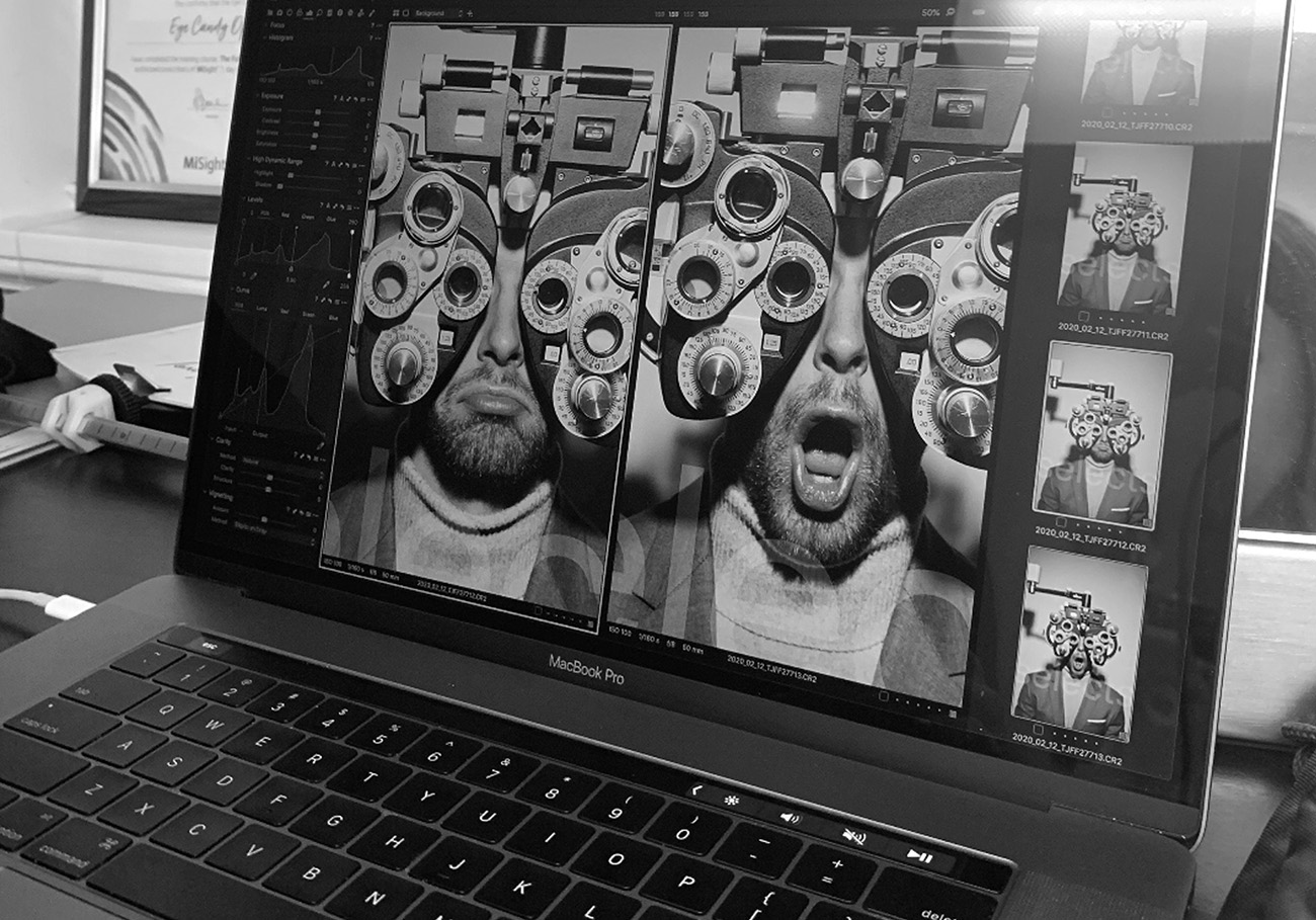
At the end of the shoot I got to take a turn behind the phoroptor
Luckily, everything went smoothly on the day of the shoot (a month before lockdown). Despite being too amped up to take bathroom breaks or eat, I was happy with the results. I felt so fortunate to work with such a great team of people — talented photographer, easy-going models, a colleague to assist me with last minute details and clients who trust your vision.
Axonify 1Mission
Corporate brands are generally pretty militant when it comes to adhering to their brand guidelines…for good reason (brand consistency for the win!). But when Rogers requested creative to promote an internal employee program aimed to improve skills through a series of games, I was excited to hear that they were open to off-brand creative.
Instead of representing a telecommunications company with the most current devices, I wanted to use old tech — a flip phone, bulky desktop computer, Walkman, rotary phone — to create eye-catching graphics that was both youthful and nostalgic. The goal was to motivate employees to use the program pursue an expert level of skill and knowledge and excel in their jobs.
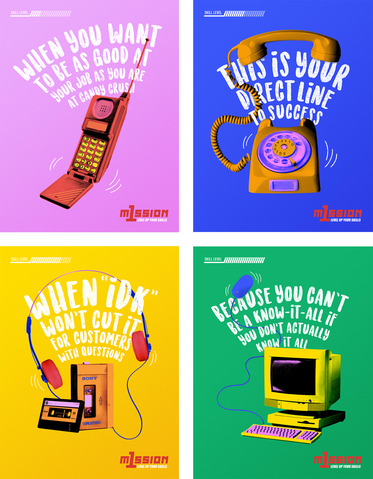
I designed a series of 4 colour-blocked pieces featuring pop art-stylized images of old tech paired with playful copywriting that was arranged in curved lines to mimic a wi-fi signal. Leaning in to the nostalgic angle, I referenced old school video game aesthetics for the logo font and added a skill progress bar in the corner of each poster.
The result was very Lisa Frank x Rogers that really appealed to my inner 11-year old 😸
Strong Is My Beautiful logo
A dream project for any creative professional is to be able to combine our craft with other pursuits that we’re passionate about. Boxing has always been my preferred method of therapy (punch the rage out!) so designing a logo for Strong Is My Beautiful, a fitness and lifestyle brand, was right up my alley.
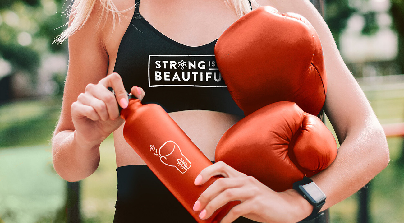
The brand name felt like a call-to-action; an identity-defining mindset claimed with honour. To reflect that pride, I drew inspiration from familial coat of arms and NASA patches designed for specific missions.
Anchored within a badge-like shape I designed a boxing glove held aloft (like a hand fisted in solidarity) clutching a single gladiolus bloom (a symbol of strength and solidarity).
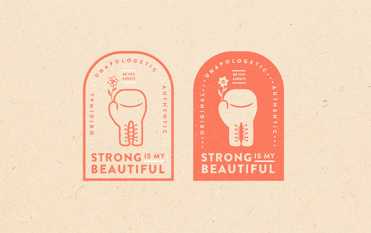
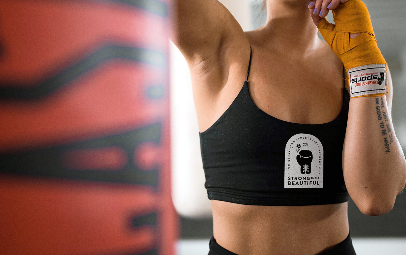
To reflect the core values of the brand — positivity, empowerment and embracing duality — I chose a solid, bold font, paired bright colours with more subtle tones, and contrasted smooth lines with gritty textures.
Cocktail Hour Art
My journey as a graphic designer in Toronto began with embarrassingly emo Photoshop experiments when I was a teenager. Since then, I’ve leaned more towards photographic solutions over illustrative, continuing a narrative in my head that illustration wasn’t my strength. But to be good at anything, you have to practice.
Well, lockdown afforded me the time to develop my skills as a graphic designer in Toronto and the perfect opportunity. While brainstorming ways to engage with our clients AND support a local business, we decided to throw a virtual holiday mixer.
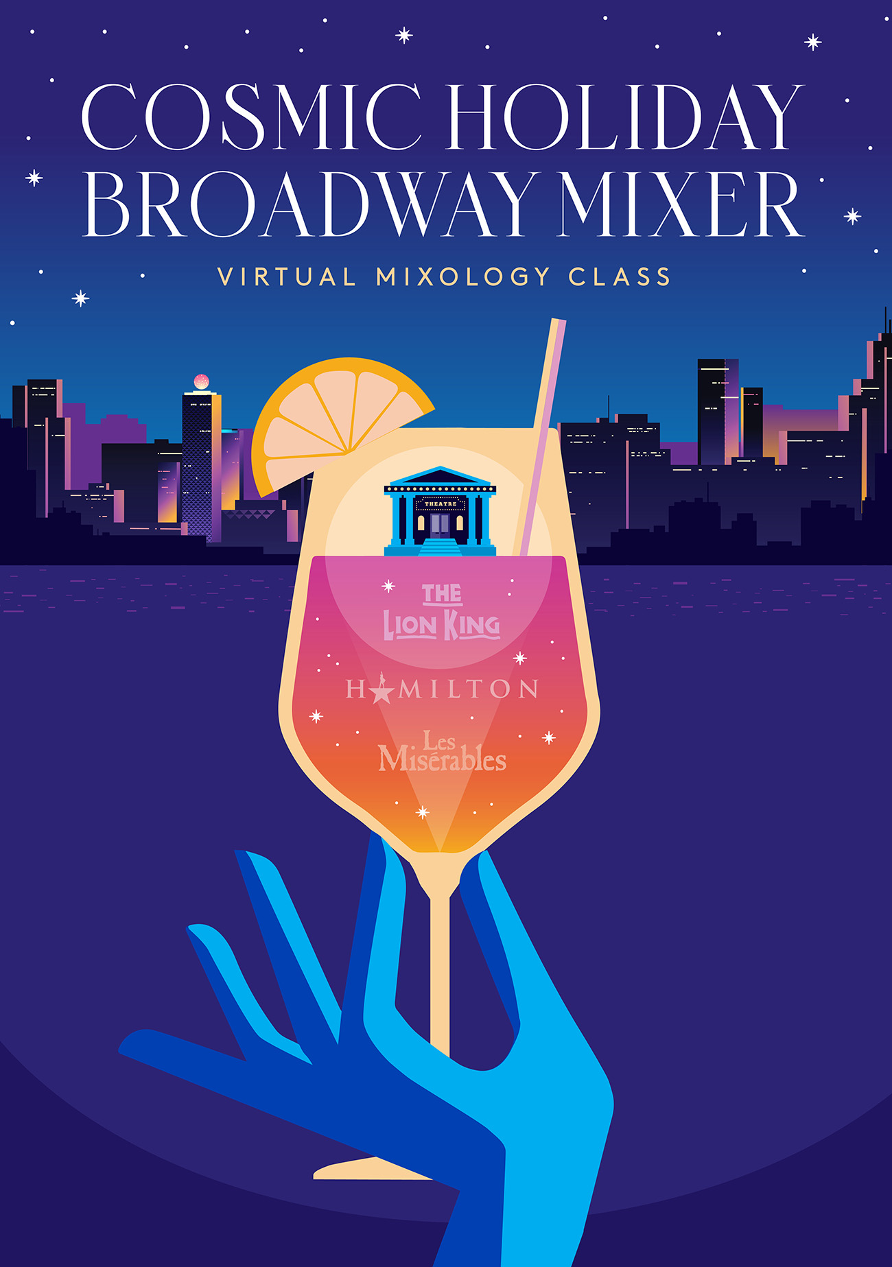
Since inviting clients to a night at the theatre isn’t possible in quarantine times, we recruited Mother Cocktails to create custom Broadway-inspired cocktails and host a mixology masterclass via Zoom. My job was to illustrate the main creative for the e-vite.
Lately I’ve been obsessed with rich colour palettes and vibrant gradients so I jumped at the chance to use it. For the main creative, I illustrated a hand holding a glass up, cheers-ing to the city in the distance from home. Where the glass overlaps with the cityscape is a theatre in a spotlight highlighting the Broadway shows that the drinks were tailored for.
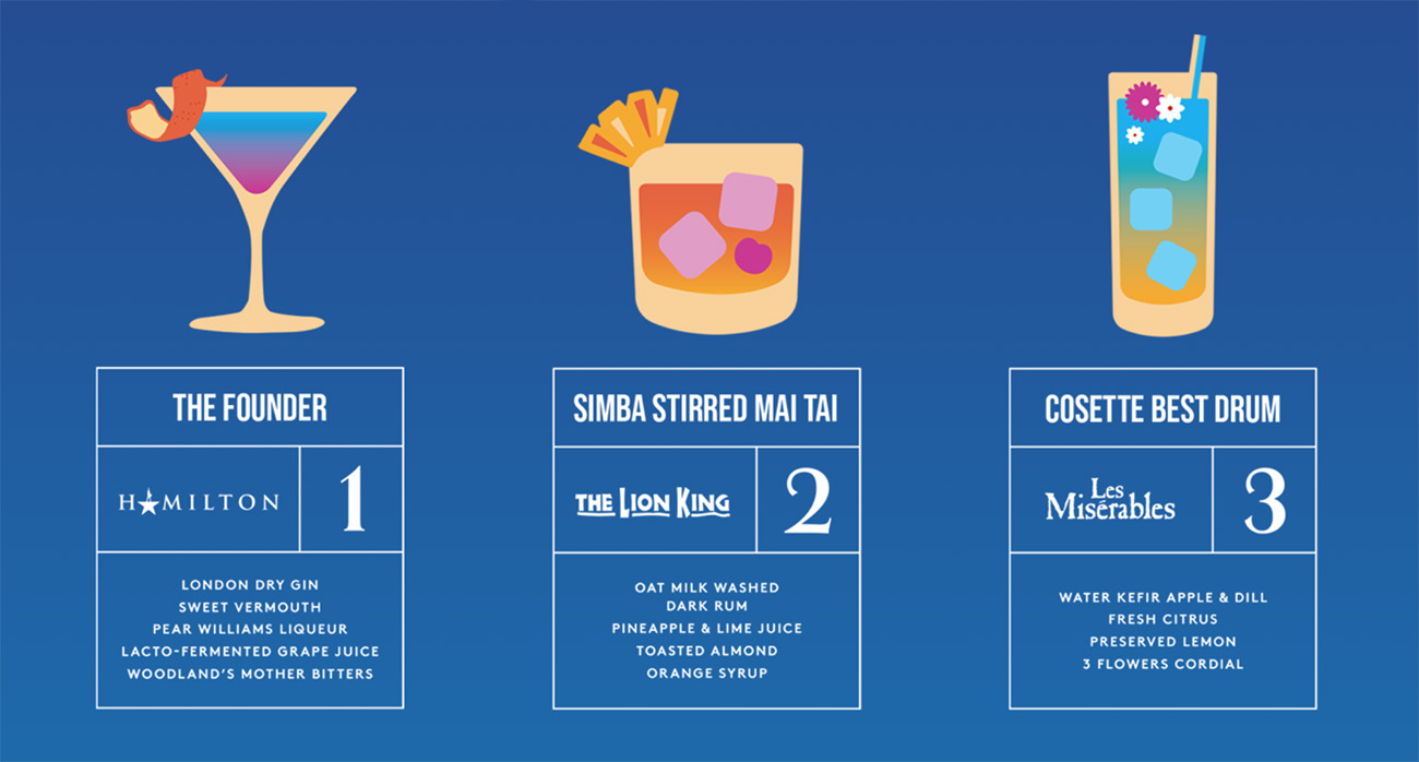
I even designed cute little cocktails with fruity garnishes so clients could visualize the inventive concoctions that are available.
Cookie Designbyte
While it’s second nature for me to think in motion, the technical aspects of animation have eluded me for years. No matter how often I stared at AfterEffects on my screen and banged my head on the keyboard, something just wouldn’t click! But for some reason it all started making sense during lockdown.
As part of DesignBytes, a series of food-centric animations some co-workers and I started for fun, I created a piece using a chocolate chop cookie to demonstrate how the clone tool works in Photoshop. The simple animation shows chocolate chips being cloned — copying a group of pixels and pasting them over another group of pixels — over the cookie in abundance, because who doesn’t want more chocolate chips?!
Was it the most groundbreaking thing I’ve ever designed? No, but it was my first time using AfterEffects that didn’t end in tears of frustration which I consider a great success.
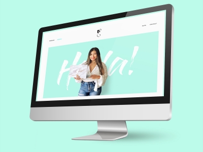
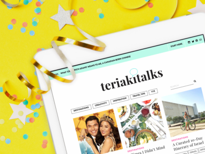
Portfolio Website
If you’re the perfect storm of ambition, idealism and procrastination (like me), you probably have dozens of creative projects on the back burner that you’ve been meaning to do for years. YEARS! Well, re-vamping my portfolio website has been at the top of that list. With all the uncertainty of 2020, it was finally time to do the damn thing.
If you’re smart, you update your portfolio regularly. If you’re me, you wait until portfolio-worthy projects pile up into a seemingly insurmountable undertaking that makes you want to take a nap every time you consider tackling it.
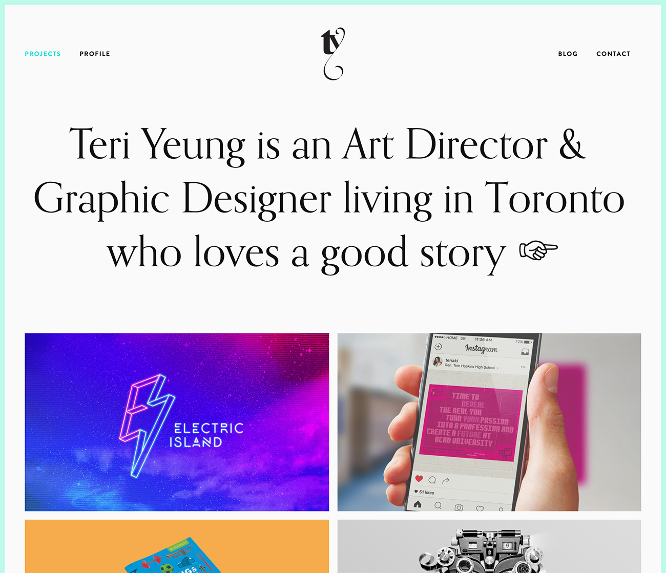
In addition to producing work that is worthy of including in your portfolio, you have to create slick mock-ups to put the design in context AND write rationales to explain your design choices. Not to mention, dealing with the headache of building a website, whether from scratch or using a service like Squarespace.
And the hardest (arguably the most important) part of a portfolio site? Writing your About Me page.
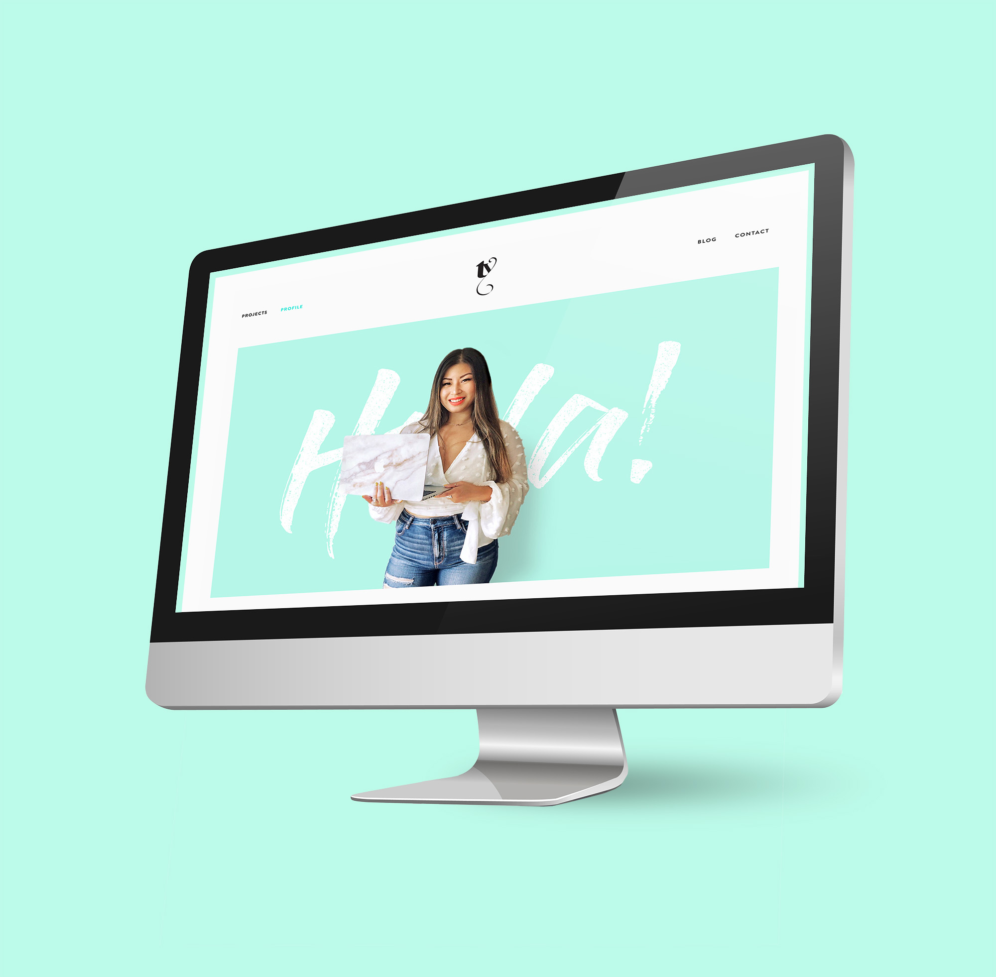
It gets very existential to try and distill who you are and what you do into a couple of paragraphs but it’s what will make you memorable. Instead of being another designer with another portfolio, you become an actual person and sometimes that makes the difference in whether a potential client wants to work with you or not.
I don’t know how useful anyone will find this post but if you’re anything like me (see: nosy AF) then maybe you’ll find the peek into what I do as an art director and graphic designer living in Toronto (when I’m not travelling or eating) to be interesting. It’s not generally what I write about, but it’s nice to see what I accomplished this year.
If you’re interested in seeing my full portfolio of work, check out my website.
Keep your stalking game strong and follow me @teriaki if you aren’t already!


0 Comments